As a leading after-market decal business, TwoBobs Aviation Graphics is known for providing the highest-quality in decal design.
However, even the best businesses need to update their branding from time to time. TwoBobs needed a logo update that was streamlined, modern, and color-flexible - it needed to be adaptable enough to work with any existing spot color, while still staying true to the brand's identity.
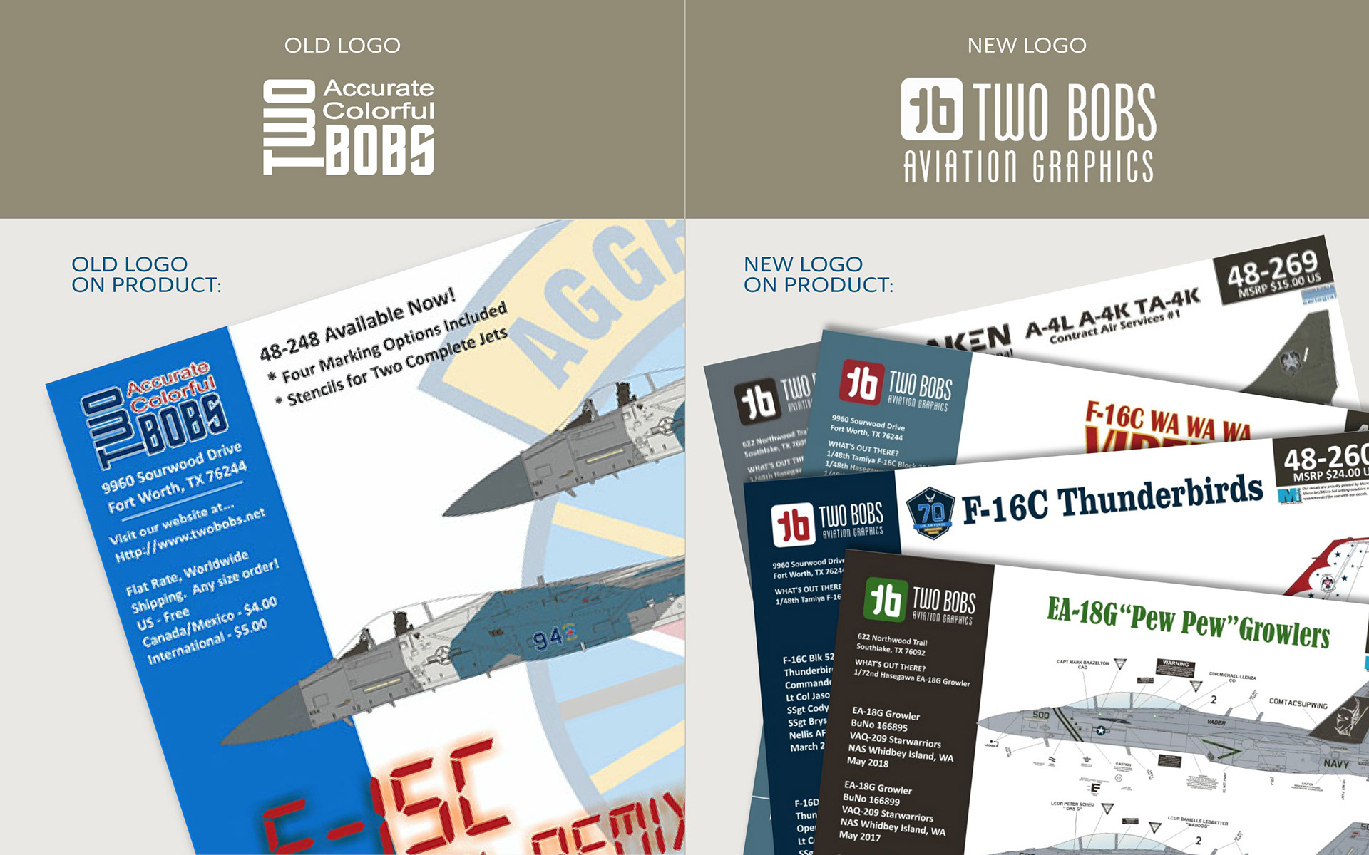
Comparison of Old vs. New Logo on Product Application
Solution:
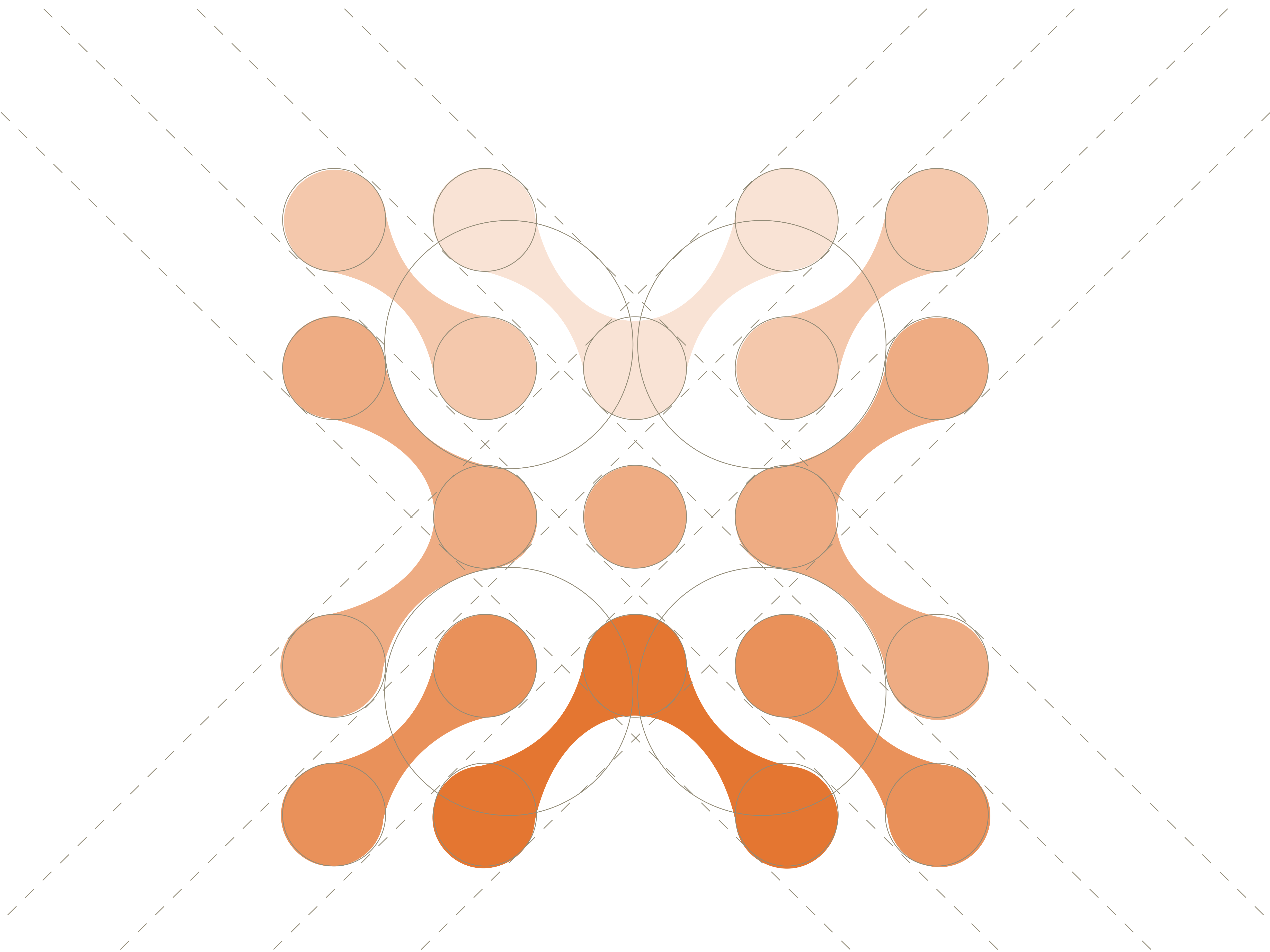
The new logo incorporated a monogram icon that was designed within a golden ratio grid. The simplicity and identifiability of this icon allowed for change in spot colors without losing the overall brand identity. Additionally, the text for the company name was updated to a modern font.
A new color palette and changes to the layout of their existing website was also generated.

Golden Ratio Logo Grid

Style Tile
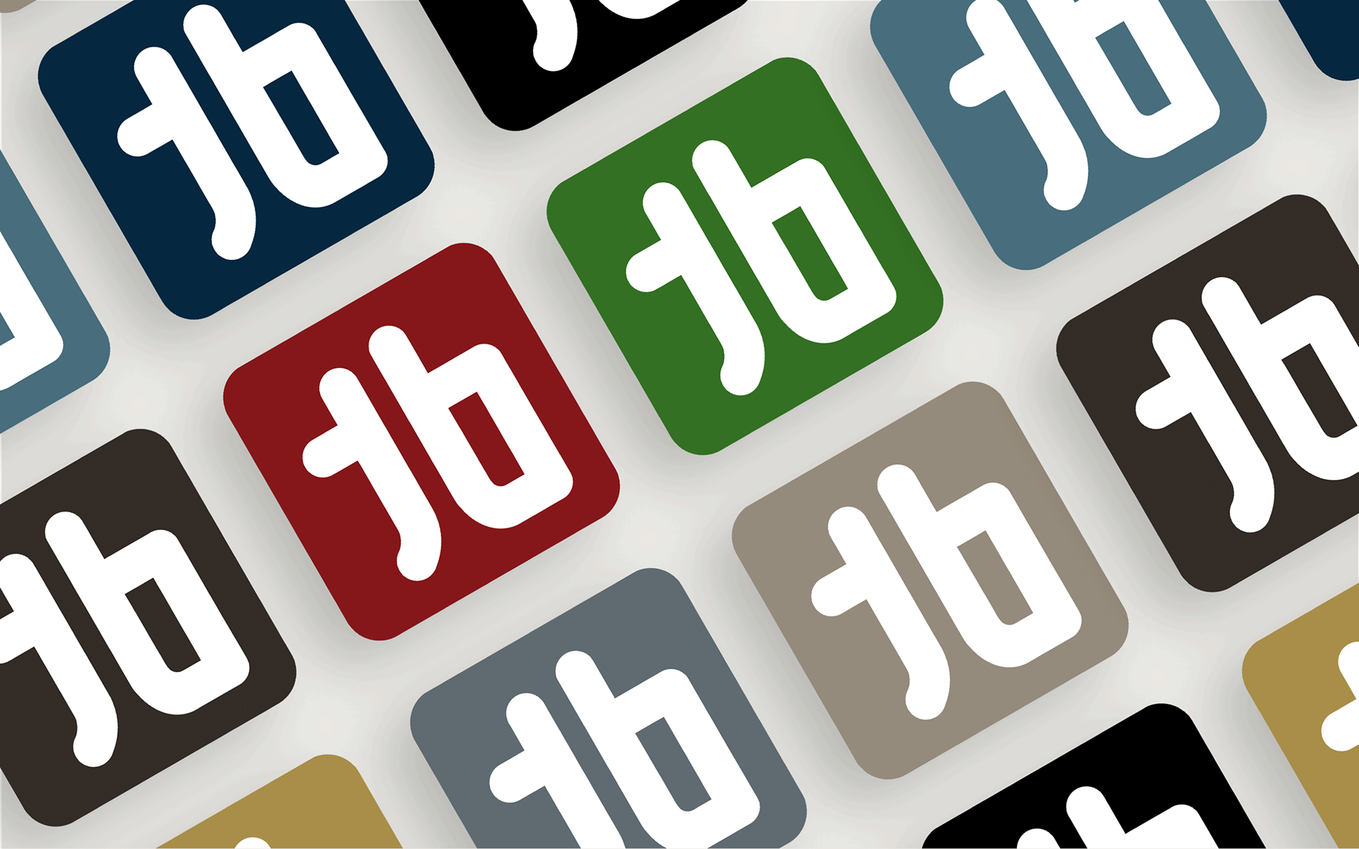
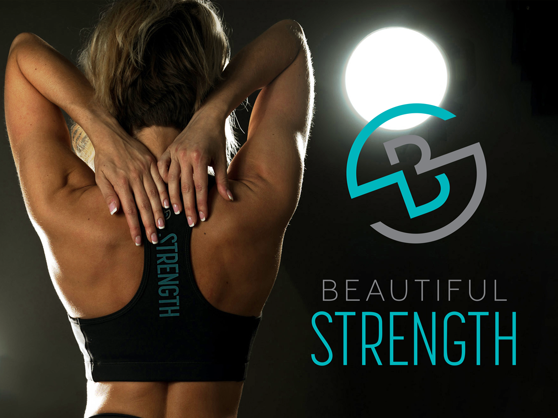
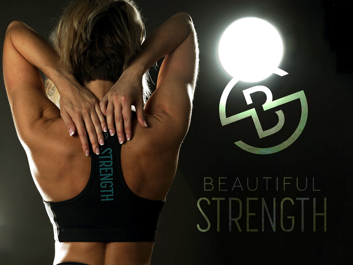
Flexible Spot Color Options for Logo
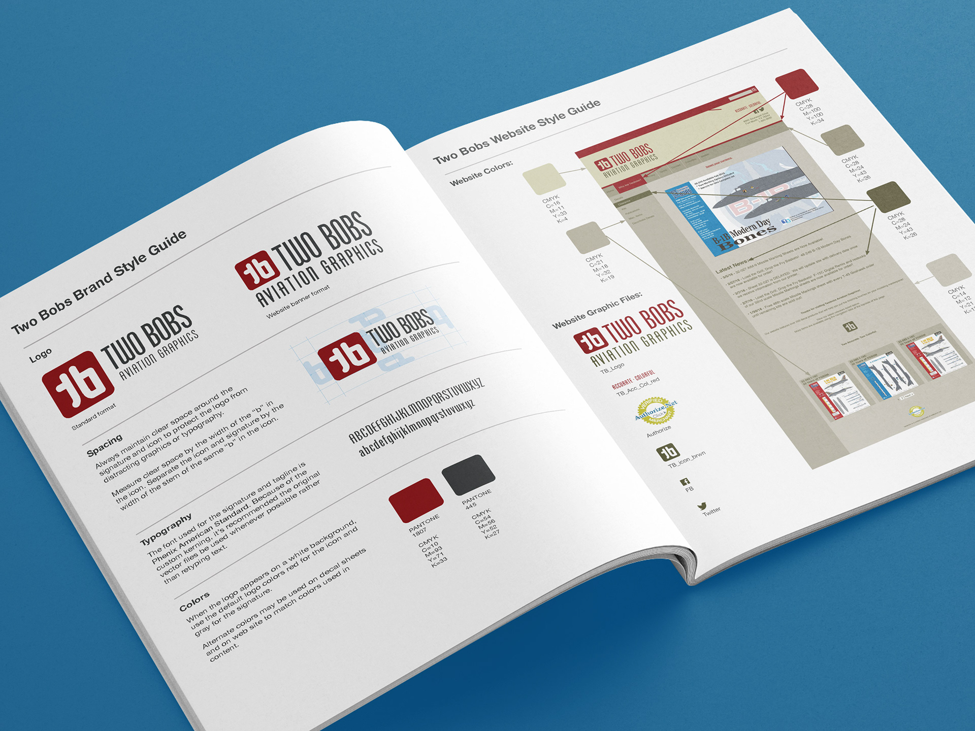
Branding Guide
The branding was implemented across all new products, marketing, promotional materials, and the website.
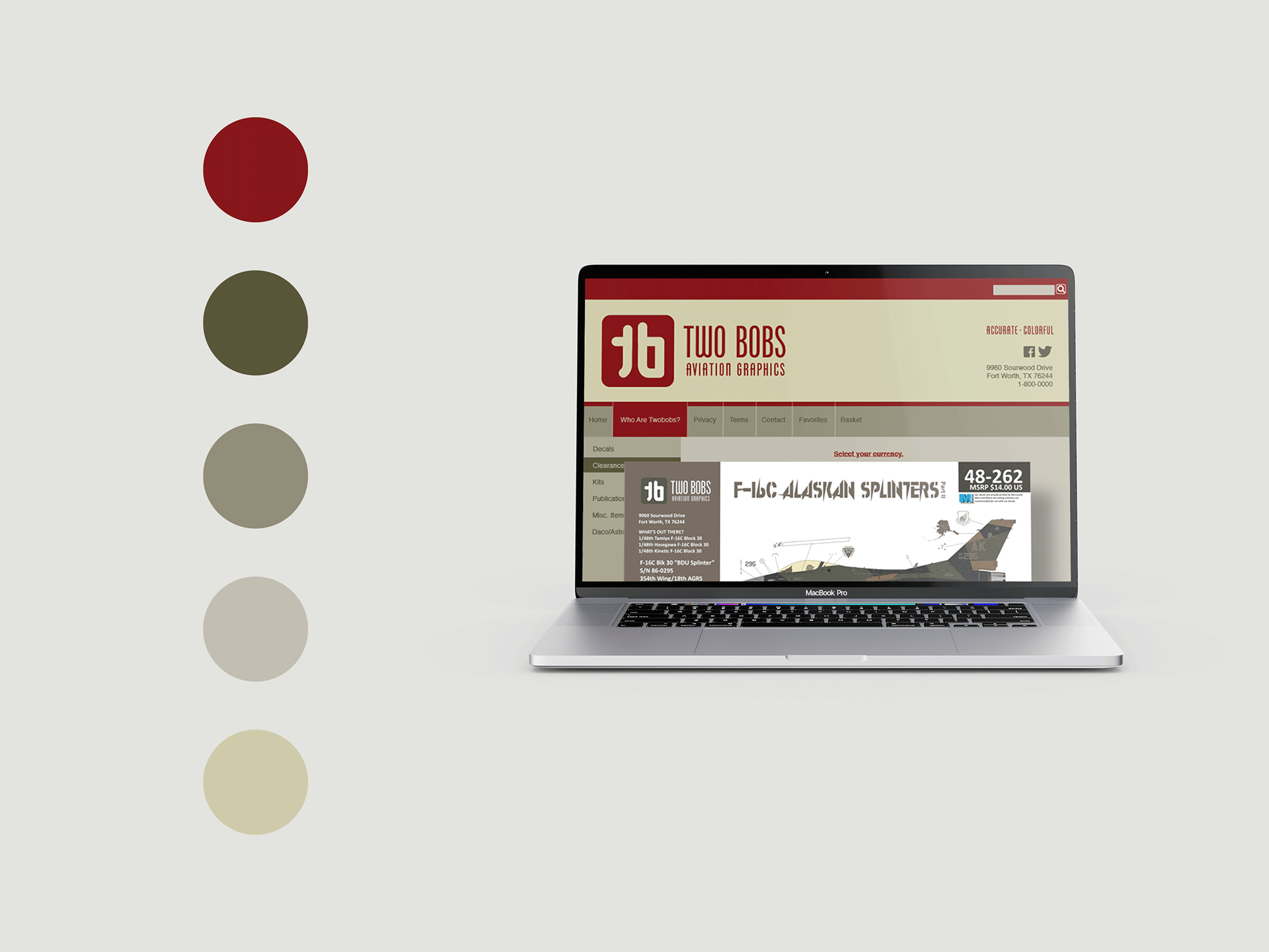
Color Palette for Website
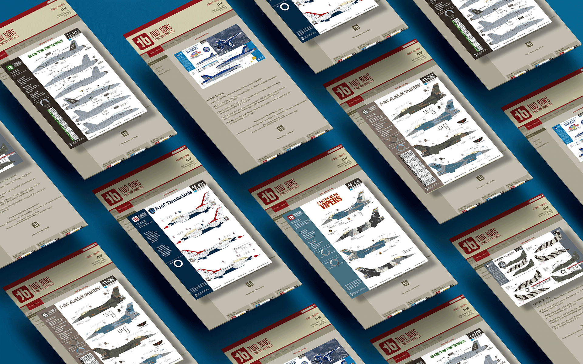
Web App Pages
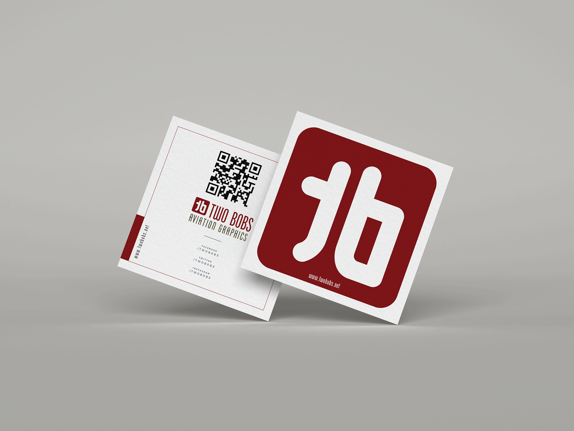
Business Cards
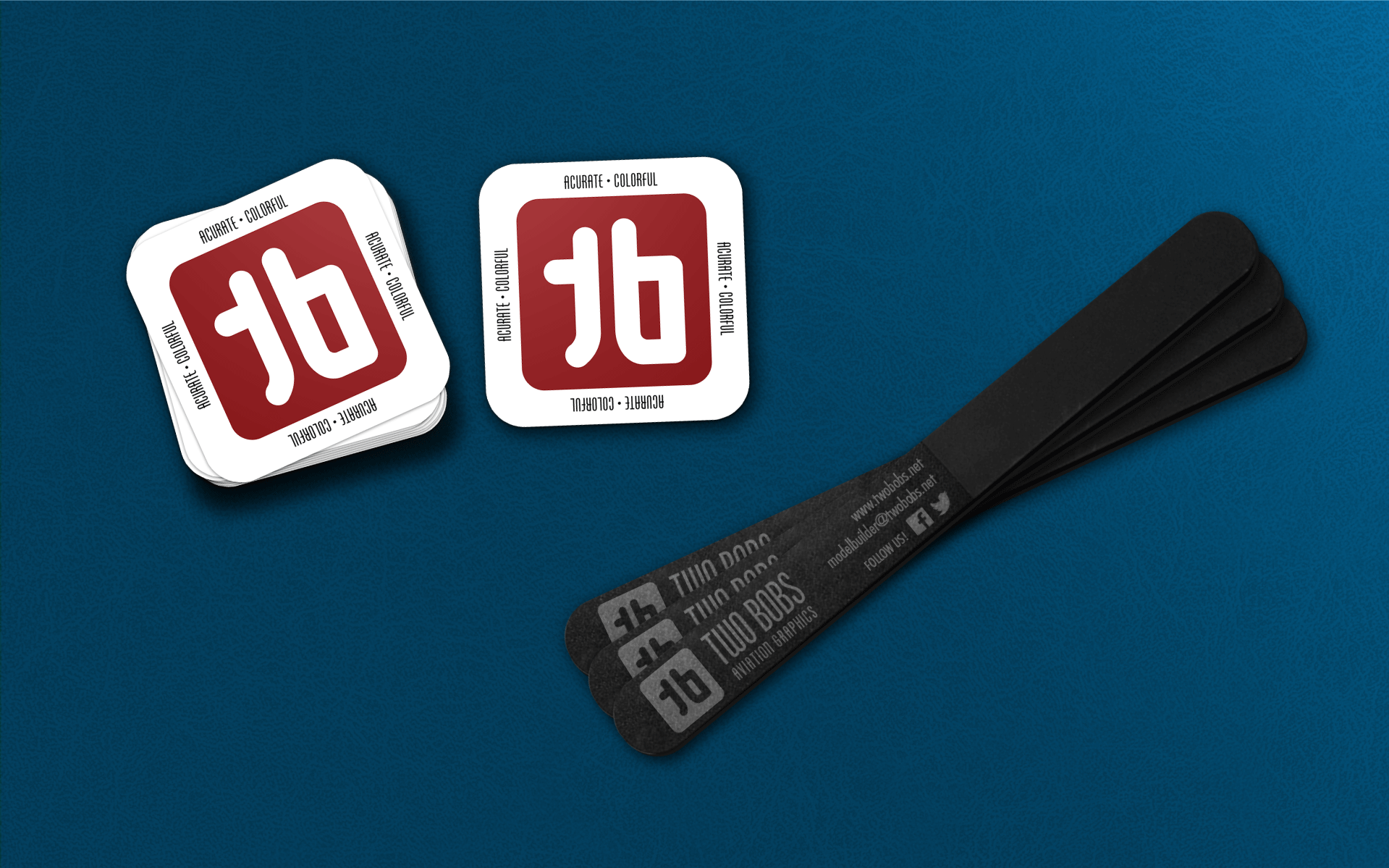
Promotional Products - Stickers, Sanding Sticks
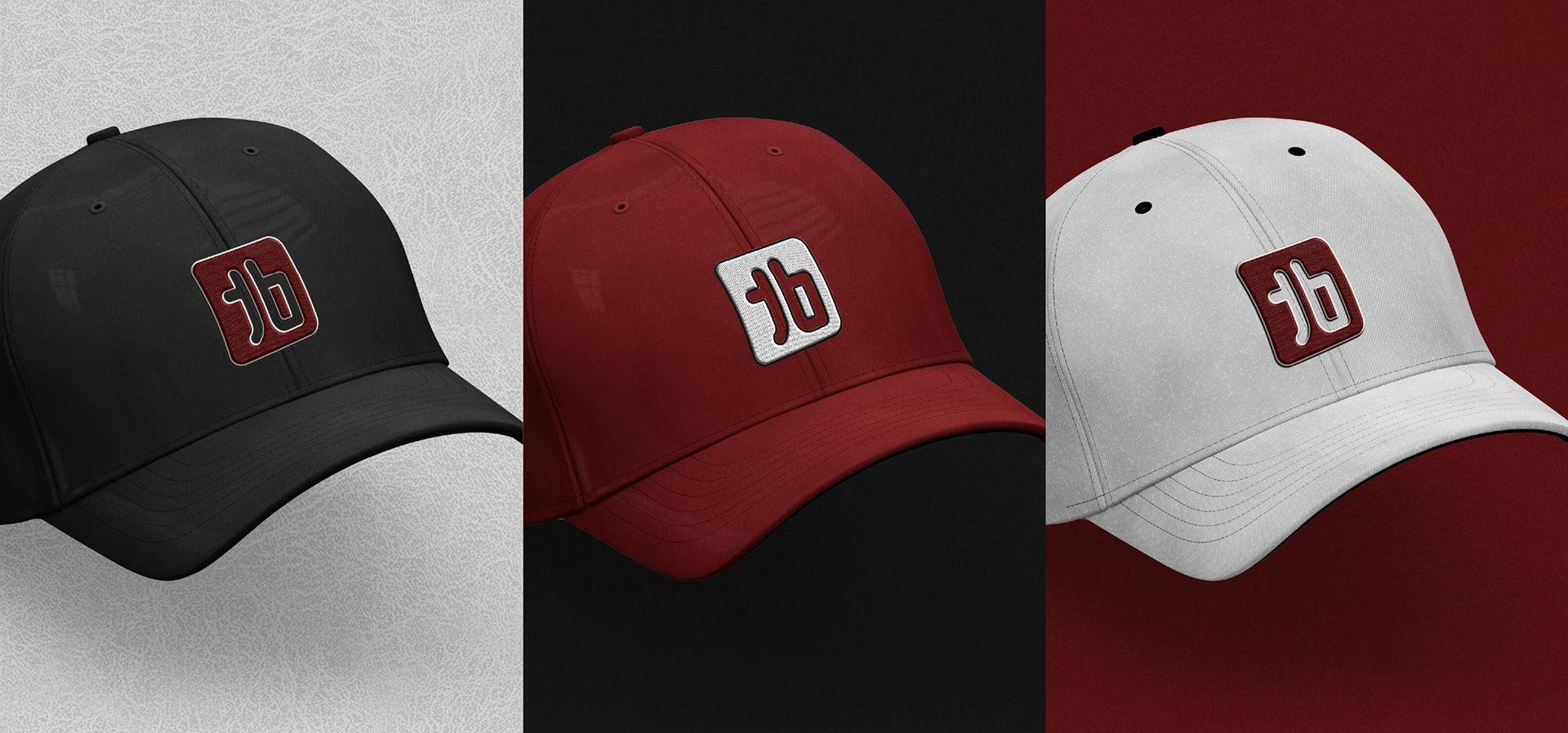
Apparel Branding
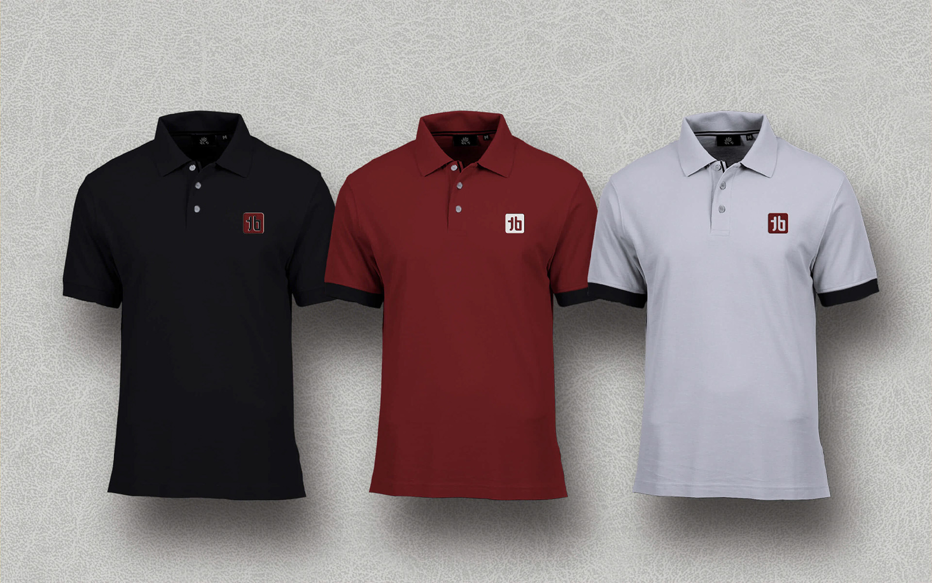
Apparel Branding
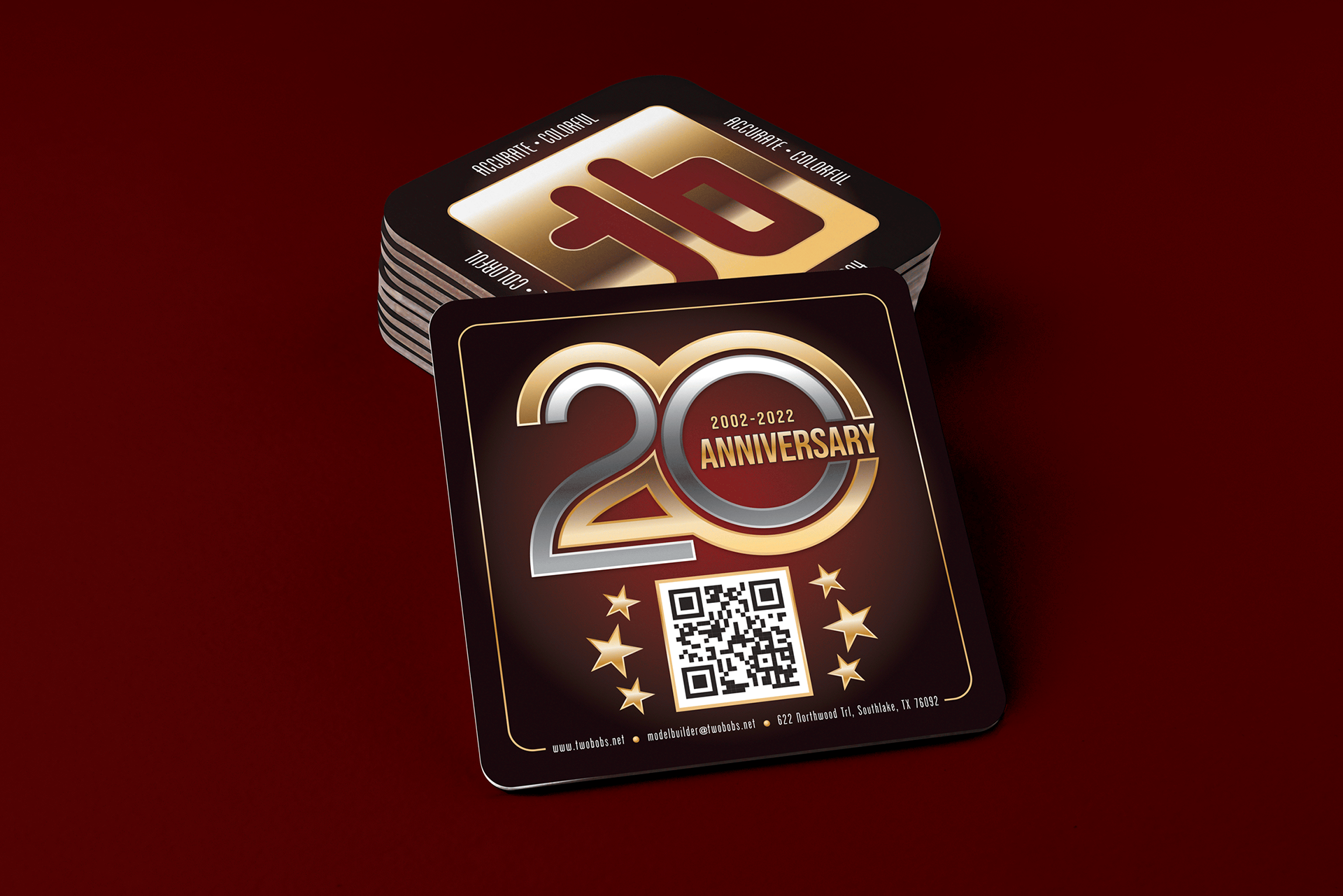
Promotional Coasters for 20th Anniversary
Conclusion:
TwoBobs decision to update their logo was a strategic financial and marketing move that helped the company save money, while improving its brand and market position. The new design allowed the company to use an existing spot color on a product decal as the color for the logo icon. This saved money in printing costs by not needing additional, separate spot colors for the logo. This color flexibility did not affect the brand. Overall, the fresh, modern take of the logo secured TwoBobs' lead in the after-market decal business, resulting in more customers and distributors for their products.
The success of TwoBobs' rebranding highlights the significance of regularly updating logos and brand assets to remain competitive in a dynamic market.